Advanced Typography - Final Compilation & Reflections

Ahmed Yaman Ibrahim (0341119)
Advanced Typography
Final Compilation & Reflections
INSTRUCTIONS
SUBMISSIONS
Exercise 1: Typographic Systems
1. Axial System
 |
| Fig. 1.1: Exercise 1: Typographic Systems - Axial System |
2. Radial System
 |
| Fig. 1.2: Exercise 1: Typographic Systems - Radial System |
3. Dilatational System
 |
| Fig. 1.3: Exercise 1: Typographic Systems - Dilatational System |
4. Random System
 |
| Fig. 1.4: Exercise 1: Typographic Systems - Random System |
5. Grid System
 |
| Fig. 1.5: Exercise 1: Typographic Systems - Grid System |
6. Transitional System
 |
| Fig. 1.6: Exercise 1: Typographic Systems - Transitional System |
7. Modular System
 |
| Fig. 1.7: Exercise 1: Typographic Systems - Modular System |
8. Bilateral System
 |
| Fig. 1.8: Exercise 1: Typographic Systems - Bilateral System |
Fig. 1.9: Exercise 1: Typographic Systems (PDF)
Exercise 2: Type & Play (Part 1) - Finding Type
 |
| Fig. 2.1: Exercise 2 part 1: Type & Play - Original image - Mosque wall |
 |
| Fig. 2.2: Exercise 2 part 1: Type & Play - Extracted letterforms (B, M, P, O, X) |
 |
| Fig. 2.3: Exercise 2 part 1: Type & Play - Digitized original letterforms |
 |
| Fig. 2.1: Exercise 2 part 1: Type & Play - Final letters |
Fig. 2.2: Exercise 2 part 1: Type & Play - Final letters (PDF)
Exercise 2: Type & Play (Part 2) - Type & Image
 |
| Fig. 2.3: Exercise 2 part 2: Type & Image - Final image |
Fig. 2.4: Exercise 2 part 2: Type & Image - Final image (PDF)
Project 1A – Key Artwork
 |
Fig. 3.2: Project 1A - Key artwork (PDF)
Project 1B – Key Artwork & Collateral
 |
| Fig. 4.1: Project 1B - Poster Fig. 4.2: Project 1B - Poster (PDF) |
 |
| Fig. 4.2: Project 1B - Animated invite |
 |
| Fig. 4.3: Project 1B - Tshirt |
Fig. 4.4: Project 1B - Tshirt (PDF)
 |
| Fig. 4.5: Project 1B - Sticker |
Fig. 4.6: Project 1B - Sticker (PDF)
 |
| Fig. 4.7: Project 1B - Face mask |
Fig. 4.8: Project 1B - Face mask (PDF)
 |
| Fig. 4.9: Project 1B - Collateral flat lay |
Fig. 4.10: Project 1B - Compilation of design collateral & flat lay (PDF)
Project 2 – Design, Exploration and Application
 |
| Fig. 5.1: Final Project - Final letters |
Fig. 5.2: Final Project - Final letters (PDF)
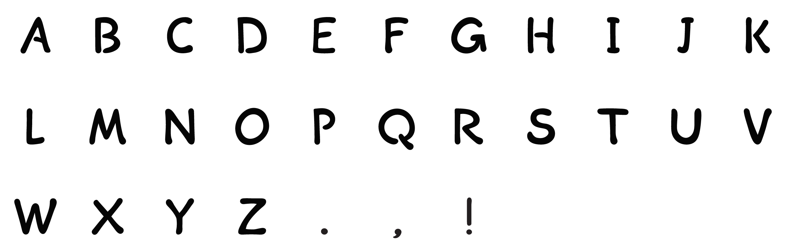
Fig. 5.3: Final Project - Final font "Thaana Latin"
 |
| Fig. 5.4: Final Project - Collateral: Book |
 |
| Fig. 5.5: Final Project - Collateral: Notebook |
 |
| Fig. 5.6: Final Project - Collateral: CD |
 |
| Fig. 5.7: Final Project - Collateral: Bookmarks with Maldivian proverbs |
 |
| Fig. 5.8: Final Project - Collateral flatlay (final) |
Fig. 5.9: Final Project - Collateral flatlay (PDF)
REFLECTIONS
Experience:
During the first two weeks of semester, I was in quarantine as I had just flown back to Malaysia. Fortunately the internet connection, which was my main concern, worked fine and I was able to take part in classes regularly. I had spent a week on the first exercise in my previous semester before I deferred, and based on the feedback Mr Vinod gave me back then, I made some more adjustments and came up with a couple more variations before choosing two designs for each Typographic System. While working on the second exercise, I found that creating letters out of imagery proved to be more difficult than I thought, as you had to consider how the end result would turn out as well, in relation to where it originated from. The pacing of classes sped up around this week and I had some trouble keeping up, as I still hadn't moved back to my apartment after quarantine yet. The third exercise was a lot more enjoyable in comparison as I got to explore a lot more. The first project (designing key artwork) was quite difficult. I needed to do a lot more research than what I'd already done. Trying to come up with a design that accurately reflected Russian Constructivism while also being something that could be used in a logo-like context was especially troublesome. This was the case with the second exercise as well, but I felt I had a bit more freedom to explore as it was collateral. I had started brainstorming for my final project a few weeks ahead, so I was able to come up with the final idea quite quickly, which Mr Vinod approved as well. Designing the letters was a struggle, and I wasn't able to manage my time well enough to develop a full uppercase and lowercase set, so I went ahead with just the uppercase set and tried to make use of it as best I could. I had fun designing the collateral for it, and Mr Vinod noted that it was designed well too, despite overusing the artwork a bit.
Observation:
I struggled quite a bit with the typographic systems and I noticed that others did as well, but it was interesting to see the different types of variations my classmates were able to come up with. This was the case with the second exercise as well; being able to see everyone's artwork gave me quite a lot of ideas for potential future projects. Overall, Project 1A and 1B were the most difficult out of all the work I did for this subject, and I think the same applies to most of the other students as well. A lot of us struggled with creating a key artwork that was applicable in the ways that it should be used. Designing collateral felt a bit easier in comparison. For the final project, I learned quite a bit about how my own language's script was created with the research I did. I wasn't able to apply it as well as I wanted in my final outcome, but nevertheless I believe I was able to apply it into the collateral well enough.
Findings:
Throughout this subject, I learned that doing in-depth research on the source of whatever I was designing for improved my work a great deal, as it helped me understand the context of what I was creating. This was especially true for Project 1 and 2. I also learned that trying to keep a design consistent throughout a project didn't mean I needed to make everything look the same, as long as I was able to convey the general look and feel while slightly tweaking the design for the different applications it was to be used in. I also found that, ironically, I was slowly able to manage my time better the MORE work that I had piled on me. Probably not a good idea to maintain something like that in the long run, however.
Overall, this semester was incredibly hectic. At no point did I feel like I didn't enjoy the subject, but there were several times where I felt like I needed to stop and do something else for a change, as the workload for all the subjects was quite heavy. Mr Vinod's feedback was incredibly helpful and I tried to make as much use of it as I could with the time I had. I feel like I could have done a lot more and a lot better if I managed my time properly, so I'm a bit unsatisfied with my work overall. However, I can only look back on it as a learning experience and focus on making my future work better. While Typography and Advanced Typography were quite busy subjects overall, I'd have to say they were the subjects I enjoyed the most as well. Figuring out how to balance that workload with other subjects is entirely on me, and I'd say I'm slowly getting better at that.


