Advanced Typography - Exercises

26/08/20 - 23/09/20 (Week 1 - 5)
Ahmed Yaman Ibrahim (0341119)
Advanced Typography
Exercises
LECTURE NOTES
Lecture 1: Briefing & Typographic Systems
26/08/20 (Week 1)
Our first lecture consisted of a briefing of the module to all students followed by a lecture on our first exercise topic: Typographic Systems. We were shown excerpts of the book Typographic Systems by Kimberly Elam for reference.
Typographic Systems
The 8 typographic systems mentioned above are Axial, Radial, Dilatational, Random, Grid, Modular, Transitional and Bilateral. These systems are meant to serve as a sort of organizational framework for arranging type on a composition in a way that is functional and visually sound.
1. Axial System
In the axial system, type is aligned to either side of an axis. This is especially helpful when organizing lists, or several bodies of text on a composition.
2. Radial system
In this system, the type extends outward from a single point of focus, in a circular manner.
3. Dilatational System
This is somewhat similar to the radial system, however instead of having the type extend outwards, it circulates around the point of focus.
4. Random System
In the random system, type is arranged without any specific pattern or definite relationship to each other.
5. Grid System
In the grid system, the composition is divided into rows and columns, with all the type being arranged within these lines.
6. Transitional System
In the transitional system, the type is arranged in a way that creates a sense of motion.
7. Modular System
The modular system is similar to the grid system, except the elements within the grids are interchangeable.
8. Bilateral System
In the bilateral system, all type is center-aligned to a single axis.
Lecture 2: Typographic Composition
Lecture 3: Context & Creativity
Lecture 4: Designing Type
The 8 typographic systems mentioned above are Axial, Radial, Dilatational, Random, Grid, Modular, Transitional and Bilateral. These systems are meant to serve as a sort of organizational framework for arranging type on a composition in a way that is functional and visually sound.
1. Axial System
In the axial system, type is aligned to either side of an axis. This is especially helpful when organizing lists, or several bodies of text on a composition.
 |
| Fig. 1.1: Axial system examples |
2. Radial system
In this system, the type extends outward from a single point of focus, in a circular manner.
 |
| Fig. 1.2: Radial system examples |
3. Dilatational System
This is somewhat similar to the radial system, however instead of having the type extend outwards, it circulates around the point of focus.
 |
| Fig. 1.3: Dilatational system examples |
4. Random System
In the random system, type is arranged without any specific pattern or definite relationship to each other.
 |
| Fig. 1.4: Random system examples |
5. Grid System
In the grid system, the composition is divided into rows and columns, with all the type being arranged within these lines.
 |
| Fig. 1.5: Grid system examples |
6. Transitional System
In the transitional system, the type is arranged in a way that creates a sense of motion.
 |
| Fig. 1.6: Transitional system example |
7. Modular System
The modular system is similar to the grid system, except the elements within the grids are interchangeable.
 |
| Fig. 1.7: Modular system examples |
8. Bilateral System
In the bilateral system, all type is center-aligned to a single axis.
 |
| Fig. 1.8: Bilateral system examples |
Lecture 2: Typographic Composition
2/09/20 (Week 2)
This week's lecture was on typographic composition; this involves the various principles that generally come under design composition (such as emphasis, isolation, repetition, alignment and perspective) and how they can be translated on to typographic layout designs. While these principles are mainly used in real-life design contexts and for imagery, there are ways that they can be applied onto typography.
 |
| Fig. 1.9: An example of how emphasis can be applied in a typographic layout |
 |
| Fig. 1.10: How the rule of thirds could possibly be used in a typographic layout |
 |
| Fig. 1.11: Versatility of the grid system |
Other models of composition were also explained in the lecture, such as the environmental grid which makes use of an existing structure (or structures) and its lines and shapes to create a typographic composition. This particular system makes use of non-objective elements as well, to create a mix of text and imagery.
 |
| Fig. 1.12: Example of an environmental grid |
Lecture 3: Context & Creativity
9/09/20 (Week 3)
This week's lecture was on context and creativity. This topic covered the history and evolution of letterforms and handwriting over generations, and its importance in the study of typography.
 |
| Fig. 1.13: Evolution of the Latin Alphabet |
Lecture 4: Designing Type
16/09/20 (Week 4)
This week's lecture was on designing type, explaining the purpose of creating new typefaces, as well as looking into the history, purpose and limitations behind some existing typefaces. The lecture also looked into the process of type construction and digitization.
 |
| Fig. 1.14: Ink traps in type design |
INSTRUCTIONS
EXERCISE
Exercise 1: Typographic Systems (Week 1)
Our first exercise was to use the 8 typographic systems to create 16 layouts (2 for each system). The size of each page on the spreads are meant to be 200x200m, and we are only meant to use one color besides black and white. The first design we create for each typographic system is for us to understand how to make use of it properly, while the second design is for us to explore a bit further. We were given the following copy to be used in the designs:
Below are my initial layouts:
2. Radial System
The Design School,
Taylor’s University
All Ripped Up: Punk Influences on Design
or
The ABCs of Bauhaus Design Theory
or
Russian Constructivism and Graphic Design
Open Public Lectures:
November 24, 2020
Lew Pik Svonn, 9AM-10AM
Ezrena Mohd., 10AM-11AM
Suzy Sulaiman, 11AM-12PM
November 25, 2020
Muthu Neduraman, 9AM-10AM
Fahmi Reza, 10AM-11AM
Fahmi Fadzil, 11AM-12PM
Lecture Theatre 12
Below are my initial layouts:
1. Axial System
 |
| Fig. 2.1: Exercise 1: Typographic Systems - Axial System |
2. Radial System
 |
| Fig. 2.2: Exercise 1: Typographic Systems - Radial System |
3. Dilatational System
 |
| Fig. 2.3: Exercise 1: Typographic Systems - Dilatational System |
4. Random System
 |
| Fig. 2.4: Exercise 1: Typographic Systems - Random System |
5. Grid System
 |
| Fig. 2.5: Exercise 1: Typographic Systems - Grid System |
6. Transitional System
 |
| Fig. 2.6: Exercise 1: Typographic Systems - Transitional System |
7. Modular System
 |
| Fig. 2.7: Exercise 1: Typographic Systems - Modular System |
8. Bilateral System
 |
| Fig. 2.8: Exercise 1: Typographic Systems - Bilateral System |
Fig. 2.9: Exercise 1: Typographic Systems (PDF)
Exercise 2 part 1: Type & Play
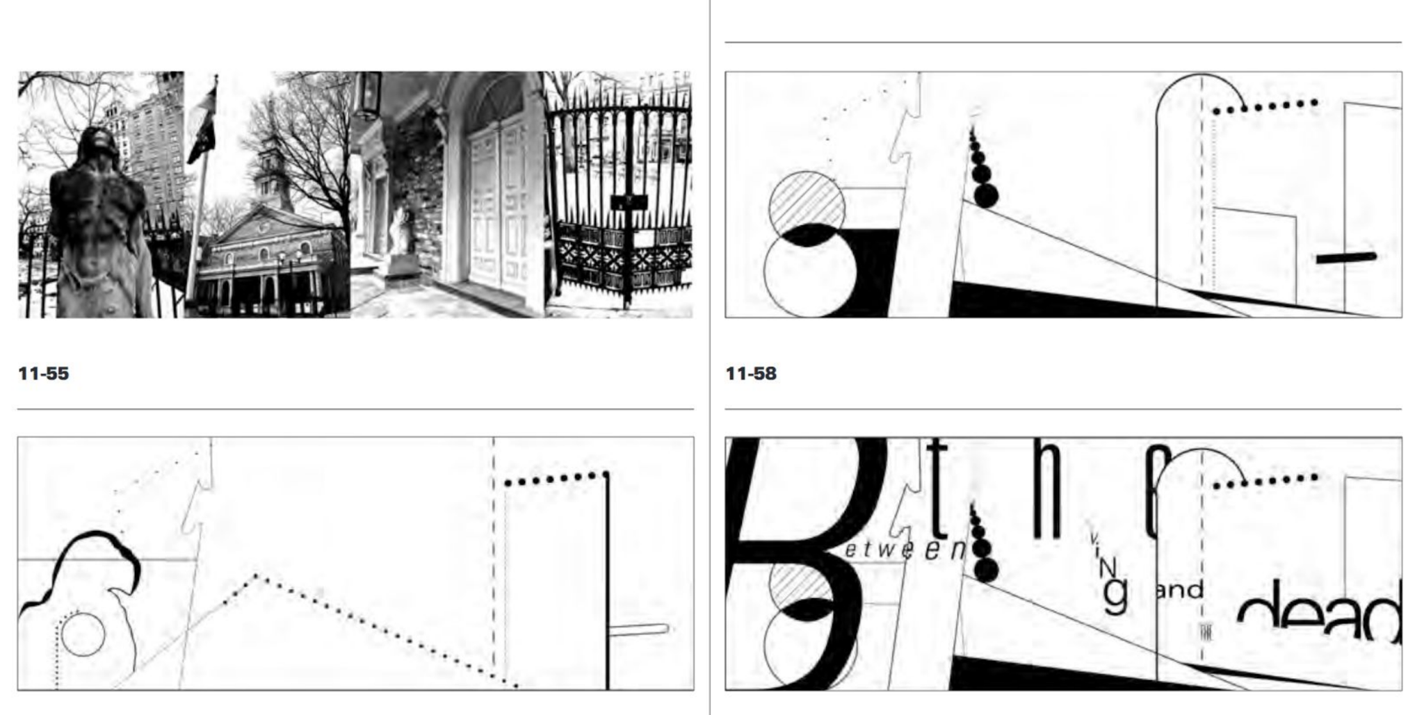
For this exercise, we were tasked with choosing an image (of either a man-made structure or nature), and then to dissect the image in a way that we can find and extract any possible letters from it. We were to then digitize these letters and then work on them until they are refined but in a way that they still reflect the source image. After looking through several images, I settled on an image of a mosque wall and went about looking for possible letterforms on it.
 |
| Fig. 2.9: Exercise 2 part 1: Type & Play - Mosque wall |
 |
| Fig. 2.10: Exercise 2 part 1: Type & Play - Tracing lines |
 |
| Fig. 2.11: Exercise 2 part 1: Type & Play - Extracted letterforms (B, M, P, O, X) |
 |
| Fig. 2.12: Exercise 2 part 1: Type & Play - Digitizing letterforms |
As the extracted letterforms are quite sharp and jagged, I wanted to use a typeface that felt evenly balanced as a reference typeface for me to carry out my refinement process. I chose a typeface named Questrial.
 |
| Fig. 2.13: Exercise 2 part 1: Type & Play - Reference typeface (Questrial) |
 |
| Fig. 2.14: Exercise 2 part 1: Type & Play - Refinement process |
As shown on the mosque wall, quite a lot of the lines angular and are seen to overlap each other, and I wanted to depict that in my design.
 |
| Fig. 2.15: Exercise 2 part 1: Type & Play - Refinement process (cont.) |
 |
| Fig. 2.16: Exercise 2 part 1: Type & Play - Refinement process (cont.) |
 |
| Fig. 2.17: Exercise 2 part 1: Type & Play - Letters |
Fig. 2.18: Exercise 2 part 1: Type & Play - Letters (PDF)
Exercise 2 part 2: Type & Image
For this exercise, we were to pick an image of our choosing (of a human, man-made structures or nature) and apply type to it, combining the image and type in a way that they enhance each other.
For my initial design, I chose an image of a footballer, aiming to emphasize his movement using type.
 |
| Fig. 2.18: Exercise 2 part 2: Type & Image option 1 - Initial photo |
 |
| Fig. 2.19: Exercise 2 part 2: Type & Image option 1 - Isolated from background |
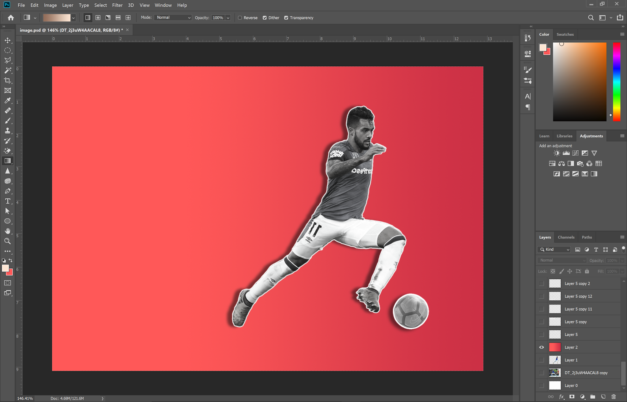 |
| Fig. 2.20: Exercise 2 part 2: Type & Image option 1 - Added new background |
 |
| Fig. 2.21: Exercise 2 part 2: Type & Image option 1 - Movement lines |
 |
| Fig. 2.22: Exercise 2 part 2: Type & Image option 1 - Added type |
 |
| Fig. 2.23: Exercise 2 part 2: Type & Image option 1 - Final outcome |
This didn't turn out the way I wanted it to, and I then realized that I also went quite off-track from what I was supposed to do; I was supposed to add type to an existing image without altering it or getting rid of most of its elements. I decided to try another image.
 |
| Fig. 2.24: Exercise 2 part 2: Type & Image option 2 - Cityscape photo |
 |
| Fig. 2.25: Exercise 2 part 2: Type & Image option 2 - Adjusted color and saturation |
 |
| Fig. 2.26: Exercise 2 part 2: Type & Image option 2 - Chosen text |
 |
| Fig. 2.27: Exercise 2 part 2: Type & Image option 2 - Adjusted perspective, added color gradient |
 |
| Fig. 2.28: Exercise 2 part 2: Type & Image option 2 - Editing to move text behind buildings |
 |
| Fig. 2.29: Exercise 2 part 2: Type & Image option 2 - Added shadows |
 |
| Fig. 2.30: Exercise 2 part 2: Type & Image option 2 - Outcome |
Fig. 2.31: Exercise 2 part 2: Type & Image option 2 (PDF)
FEEDBACK
Week 1 (26/08/20)
General feedback:
For the first layout of each system, we are to adhere strictly to the rules of the system to understand how it works, while the second layout is for us to experiment a bit further. Hierarchy of information and legibility should take priority in each design.
Specific feedback: None
For the first layout of each system, we are to adhere strictly to the rules of the system to understand how it works, while the second layout is for us to experiment a bit further. Hierarchy of information and legibility should take priority in each design.
Specific feedback: None
Week 2 (2/09/20)
General feedback:
Pay attention to point size and leading, review lectures on modular system to make sure we're applying them properly.
Specific feedback:
Pay attention to point size and leading, review lectures on modular system to make sure we're applying them properly.
Specific feedback:
1. Axial system: Reduce point sizes and adjust leading
2. Radial system: Designs are good; adjust the size of the circle on the first design to make the text more readable
3. Grid & modular system: Rework the grids
4. Bilateral system: Add a bit of variation to the designs to make them more interesting
Mr Vinod was happy with the other designs.
Week 3 (9/09/20)
General feedback:
Make sure to date blog captions.
Specific feedback:
Make sure to date blog captions.
Specific feedback:
The letters B, M and P are fine, rework the O and adjust the stroke thickness for X. Afterwards, have a look at the rest of the letters to ensure consistency, and have a look at the gaps in the letters as well to check if some need to be taken out.
Week 4 (16/09/20)
General feedback:
Remember to add captions to images on the blog.
Specific feedback:
No feedback, I chose to work on my exercise some more before showing Mr Vinod.
Week 5 (23/09/20)
General feedback:
Ensure blogs are up to date, update feedback regularly.
Specific feedback:
Mr Vinod is happy with the image, suggests darkening the gradient for the letters towards the bottom just a bit, doesn't need to be even for all the letters depending on where they are in the cityscape.
REFLECTIONS
Experience:
Week 1 & 2: I spent the first two weeks of this semester in quarantine as I had just flown back to Malaysia. Fortunately the internet connection, which was my main concern, worked fine and I was able to take part in classes regularly. I had spent a week on the first exercise in my previous semester before I deferred, and based on the feedback Mr Vinod gave me back then I made some more adjustments and came up with a couple more variations before choosing two designs for each Typographic System. Week 3: Finding and creating letters out of imagery proved to be more difficult than I thought, as you had to consider how the end result would turn out as well, in relation to where it originated from. The pacing of classes sped up around this week and I had some trouble keeping up as I still hadn't moved back to my apartment after quarantine yet. Week 4: We had no class this week so I chose to work on my exercises some more before uploading them for feedback. I realized I wasn't doing the Type & Image exercise the way I should, so I chose to redo it all over again.
Observation:
Week 1 & 2: I had some trouble with the random system when working on the exercise, as I couldn't bring myself to create a layout that I personally found appealing. I'm still not as happy with the designs, but I'll wait on feedback from my lecturer to make any changes. Week 3: I noticed that the end result was better if I focused on trying to stay true to the design's origin rather than trying to refine it too much. Week 4: Rather than trying to visualize the end result in my head before I started on the artwork, I found that it was much more efficient to start with a general idea and experiment with it as I went along.
Findings:
Week 1 & 2: While working on and doing variations of some of the designs I've done before, I found that one effective method of coming up with designs was to look further into the context of what I was doing the designs for; in the case of this, I tried to identify what kind of elements distinguished the Russian Constructivist style from other kinds of typography. Aside from the prominent use of shades of red and big bold lettering, I noticed that quite a lot of the designs incorporated type that was perpendicular to each other, and that most of the type used the negative space around the text in a way that was balanced and legible, making the actual text stand out even more. As I couldn't always incorporate perpendicular text into every style, I tried to even out the negative space in my designs, not just with the type but with any other non objective elements I might use in the designs as well. Week 3 & 4: While the workload for this subject was manageable, trying to balance it with the workload of all my other subjects proved to be a major challenge. I feel like I can never seem to put in my best effort for any of them, as I always end up prioritizing trying to actually finish the work on time.
FURTHER READING
Week 1 (26/08/20)
Detail in Typography by Jost Hochuli (Basics, the reading process, the letter; pg. 7-22)

Fig. 3.1: Detail in Typography by Jost Hochuli
Detail in Typography is a little book that deals with what it calls "detail-typography," which is about understanding individual components of type design, such as letters, letterspacing, line length, columns and so on. It serves as a refresher to what I learned in the first Typography module as well as going in-depth into some of the finer details. The pages I read this week focused on understanding how people actually read text (such as how their eyes move along the lines) as well as the finer details of letter design and how it has evolved over time.
 |
| Fig. 3.1: Detail in Typography by Jost Hochuli |
Detail in Typography is a little book that deals with what it calls "detail-typography," which is about understanding individual components of type design, such as letters, letterspacing, line length, columns and so on. It serves as a refresher to what I learned in the first Typography module as well as going in-depth into some of the finer details. The pages I read this week focused on understanding how people actually read text (such as how their eyes move along the lines) as well as the finer details of letter design and how it has evolved over time.
 |
| Fig. 3.2: Detail in Typography (The reading process, the letter: pages 9 and 15) |
Week 2 (2/09/20)
Detail in Typography by Jost Hochuli (The word, the line: pg. 23-46)
These pages talked about how full words are placed on a line, how the eye visualizes words as shapes and the overall legibility of large amounts of text on a page.
 |
| Fig. 3.3: Detail in Typography (The word, the line: pages 26 and 42) |
Week 3 (9/09/20)
Detail in Typography by Jost Hochuli (Linespacing, the column: pg. 47-53)
These pages linespacing in detail, understanding how to avoid 'rivers' of whitespace and the methods of aligning text on a line.
 |
| Fig. 3.4: Detail in Typography (Linespacing, the column: page 51) |
Week 4 (16/09/20)
17 Tips for Designing with Type on a Photo (https://designmodo.com/design-type-photo/)
I read this article as I felt it would help me with my Type & Image exercise. While it wasn't exactly what I was looking for, it actually did help a bit. The article covers various methods that can be used when designing type on an image, such as the use of color, perspective and effects.
 |
| Fig. 3.5: 17 Tips for Designing with Type on a Photo |


