Advanced Typography - Final Project

Ahmed Yaman Ibrahim (0341119)
Advanced Typography
Final Project
INSTRUCTIONS
Final Project
Collateral (Week 6-9)
For our final project, we are to develop a font that is intended to solve a larger problem or meant to be part of a solution in the area of our interest. After some brainstorming, I decided to come up with a Latin typeface to accompany the Maldivian Thaana script. Ideally this would be used in situations where both languages are required.
 |
| Fig. 1.1: Final Project - Dhivehi Thaana script |
I began by studying one of the available Thaana fonts; I chose one that was commonly used in both formal and informal instances, titled 'A_Waheed.'
| Fig. 1.2: Final Project - Thaana font A_Waheed |
I looked at how the letters were designed, particularly the ends of the letters, and tried to design a lowercase typefaces inspired from elements of the Thaana script.
 |
| Fig. 1.3: Final Project - Initial letter design |
I used Comic Sans as a base as it most closely resembled the Thaana script in my opinion. During the initial feedback session, Mr Vinod explained that I should adjust the end points of the letters to make them less prominent. With the way the letters were looking right now, they simply felt too informal. He suggested that I either redesign with capital letters or continue with the current design. I decided to scrap this and redesign with capital letters.
 |
| Fig. 1.4: Final Project - Designing uppercase letters |
I tried doing a lowercase version of this style as well but it didn't turn out the way I wanted it to and with the time constraints that I had, I decided to scrap it altogether and went ahead with the uppercase letters.
 |
| Fig. 1.5: Final Project - Uppercase letters |
Fig. 1.6: Final Project - Final typeface (PDF)
I then imported the letters into FontLab and began converting it into a working font.
 |
| Fig. 1.7: Final Project - Typeface imported into FontLab |
 |
| Fig. 1.8: Final Project - Adjusting kerning |
Fig. 1.9: Final Project - Final font
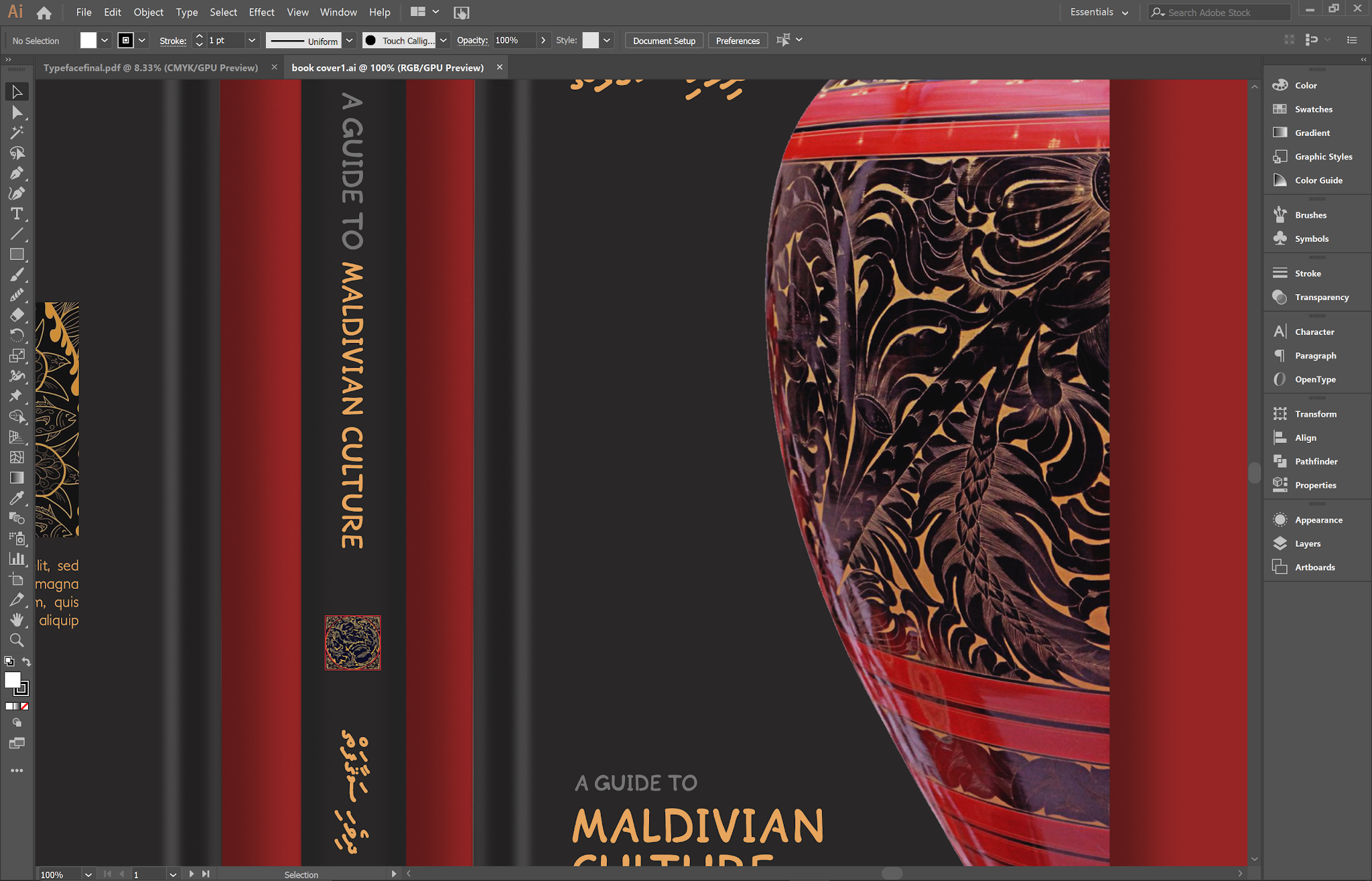
I then began designing collateral. I decided to create collateral where both Thaana and the font I created could be used in the same place - the use-case I came up with was educational material on Maldivian culture. This included books, a CD and bookmarks. For artwork, I used traditional Maldivian lacquer artwork, known as 'Liyelaa.'
 |
| Fig. 1.10: Final Project - Designing collateral |
 |
| Fig. 1.11: Final Project - Collateral: Book |
 |
| Fig. 1.12: Final Project - Collateral: Notebook |
 |
| Fig. 1.13: Final Project - Collateral: CD |
 |
| Fig. 1.14: Final Project - Collateral: Bookmarks with Maldivian proverbs |
 |
| Fig. 1.15: Final Project - Collateral flatlay (final) |
Fig. 1.16: Final Project - Collateral flatlay (PDF)
FEEDBACK
Week 10 (28/10/20)
General Feedback:
Finalize ideas soon and get started on designing the typeface as soon as possible.
Specific Feedback:
Finalize ideas soon and get started on designing the typeface as soon as possible.
Specific Feedback:
The idea is fine, study the chosen Thaana typeface in detail when designing the typeface. Avoid designing slanted letters and keep them straight.
Week 11 (4/11/20)
General Feedback:
Start working on collateral ASAP.
Specific Feedback:
Start working on collateral ASAP.
Specific Feedback:
Reduce the rounded points on the letters. Either keep working on current design or come up with an alternative with capital letters. Study how the original Thaana reference typeface was designed.
Week 12 (11/11/20)
Was absent for this class.
Week 13 (18/11/20)
General Feedback:
Have all the blog posts ready for next class, check and double check all the links.
Specific Feedback:
Have all the blog posts ready for next class, check and double check all the links.
Specific Feedback:
Adjust thickness of the letters G and Z. A little overboard with the artwork use in the collateral, but it's tastefully done and acceptable due to the use case.
REFLECTIONS
Experience:
Week 10-11: Last stretch of the semester was incredibly hectic. Managing time was still the biggest issue, trying to balance the workload for all the subjects but I did what I could. I was able to come up with an idea for my final project easily enough as I thought about it over the semester, but designing the actual letters was quite frustrating. Week 11-12: The initial design I came up with wasn't working well, but when I started over from scratch it came to me quite easily. Designing collateral wasn't difficult either, as I had been trying to visualize it for weeks already, before the project actually started. Week 13: This week was just making minor adjustments and finishing up the blog, so it wasn't nearly as stressful for this subject, but I still had a massive workload from other subjects as well.
Observation:
Week 10-11: I noticed that a lot of other students were struggling with their typeface design as well, in terms of maintaining consistency. Others had done a great job from the start. Week 11-13: I felt a little troubled as other students had designed both an uppercase and lowercase set, whereas I only had uppercase letters, so I tried to use what I had as best I could when I designed the collateral.
Findings:
Week 10-11: I found that studying the original Thaana script in-depth helped a great deal when designing the Latin version, especially in terms of how the letters flowed together. Week 11-13: Trying to be as consistent as possible with the designs for my collateral turned out to be the right thing to do, as Mr Vinod mentioned that they had been tastefully done.
FURTHER READING
Week 10 (28/10/20)
Maldivian language and alphabets (https://omniglot.com/writing/thaana.htm)
 |
| Fig. 2.1: Maldivian language and alphabets |
Background study I did on the Maldivian alphabet. The website included quite a lot of additional links on the Thaana alphabet.
Week 11 (28/10/20)
Thaana fonts (http://www.wazu.jp/gallery/Fonts_Thaana.html)
 |
| Fig. 2.2: Thaana fonts |
This is a collection of Thaana various fonts with different styles. I downloaded a lot of them and experimented with how the letters worked together; I noticed that quite a lot of them had kerning issues.
Week 12 (18/10/20)
How to design a typeface system (https://www.fontself.com/blog/5-tips-to-design-a-typeface-system)
 |
| Fig. 2.3: How to design a typeface system |
This article gave me a bit of insight on how to refine my letters when designing a typeface. It helped me keep the letters I designed consistent.


