Advanced Typography - Project 1B

Ahmed Yaman Ibrahim (0341119)
Advanced Typography
Project 1B
INSTRUCTIONS
PROJECT 1B
Collateral (Week 6-9)
For Project 1B, we were to design collateral using the key artwork from Project 1A, such as posters, an animated invite, tshirts etc. We started with the poster.
Poster
 |
| Fig. 1.1: Project 1B - Poster variation 1 |
 |
| Fig. 1.2: Project 1B - Poster variation 2 |
 |
| Fig. 1.3: Project 1B - Poster variation 3 |
Mr Vinod suggested I work on the third option, and to avoid having the text overlap the design in the background and have it try to follow the shape similar to the key artwork. He also suggested that I adjust the shape of the text for "Constructivism" some more, as it still feels a bit distorted. I worked on the animated invite and tshirt designs as well.
 |
| Fig. 1.4: Project 1B - Poster variation 4 (final) Fig. 1.5: Project 1B - Poster (PDF) Animated Invite I designed the animated invite based on the poster.  |
 |
| Fig. 3.5: Project 1B - Animated invite (Final) |
Tshirts
I had some trouble coming up with designs for the tshirts, they felt uninspired.
 |
| Fig. 3.6: Project 1B - Tshirt variation 1 |
 |
| Fig. 3.6: Project 1B - Tshirt variation 2 |
 |
| Fig. 3.7: Project 1B - Tshirt variation 3 |
 |
| Fig. 3.8: Project 1B - Tshirt variation 4 (final) |
Fig. 3.9: Project 1B - Tshirt (PDF)
I then worked on additional collateral such as a sticker and a face mask.
Sticker
 |
| Fig. 3.9: Project 1B - Sticker |
Fig. 3.10: Project 1B - Sticker (PDF)
Face mask
 |
| Fig. 3.11: Project 1B - Face mask |
Fig. 3.12: Project 1B - Face mask (PDF)
Flat lay of collateral
 |
| Fig. 3.13: Project 1B - Collateral flat lay |
Fig. 3.14: Project 1B - Compilation of design collateral (PDF)
 |
| Fig. 3.15: Project 1B - Animated invite (Final - GIF) |
FEEDBACK
Week 7 (7/10/20)
General Feedback:
Ensure we understand how the different types of dashes are used. Invite for P1B collateral must be 1000x1000px.
Specific Feedback:
Ensure we understand how the different types of dashes are used. Invite for P1B collateral must be 1000x1000px.
Specific Feedback:
Initial poster design feels a bit noisy, consider including an additional typeface. For the last design, avoid having the text overlap the design in the background and have it try to follow the shape similar to the key artwork. Adjust the text for "constructivism" so it isn't as distorted on both sides.
Week 8 (14/10/20)
General Feedback:
Collateral designs must reflect key artwork. Key artwork must be used imaginatively on collateral. Textual information on animated invite must be readable.
Specific Feedback:
Collateral designs must reflect key artwork. Key artwork must be used imaginatively on collateral. Textual information on animated invite must be readable.
Specific Feedback:
Chose to work on my designs some more before consulting for feedback.
Week 9 (21/10/20)
General Feedback:
I was ill and absent for class.
I was ill and absent for class.
Specific Feedback:
Mr Vinod said my work was fine and that I may proceed with final project.
REFLECTIONS
Experience:
Week 6: While I enjoyed Project 1B, it was quite frustrating at times due to how long the process took. I usually spent most of my time focusing on my typography work while falling behind on other subjects. Week 7: I found myself missing the classroom environment as it was during projects like these that I would be able to get a hands-on experience with the work of other students. Week 8: I fell ill during this week and this put a lot of strain on my already heavy workload.
Observation:
Week 6: Trying to implement the key artwork on collateral without making it seem like it was just tacked on proved to be more complicated than I thought. Week 7: I noticed that a lot of students including myself struggled with the concept of how to use the key artwork properly. Week 8: Despite being an independent learning week, this was one of my toughest weeks as falling ill made me miss out on a lot of days that I could have gotten work done.
Findings:
Week 6: A lot of my classmates have done a great job with their work from the get-go and it inspired me to work harder on my own designs. Week 7: Experimenting during this phase was quite enjoyable, even though I didn't have much time to do so. Week 8: This project took a lot longer than any of us may have anticipated.
FURTHER READING
Week 6 (30/09/20)
Russian Constructivism - The True Vanguard Art Movement (https://www.widewalls.ch/magazine/russian-constructivism)
 |
| Fig. 4.1: Russian Constructivism - The True Vanguard Art Movement |
This article provides more background details into the Russian Constructivism movement, its use as a revolutionary tool and how elements of the movement are being used in modern art and design.
Week 7 (7/10/20)
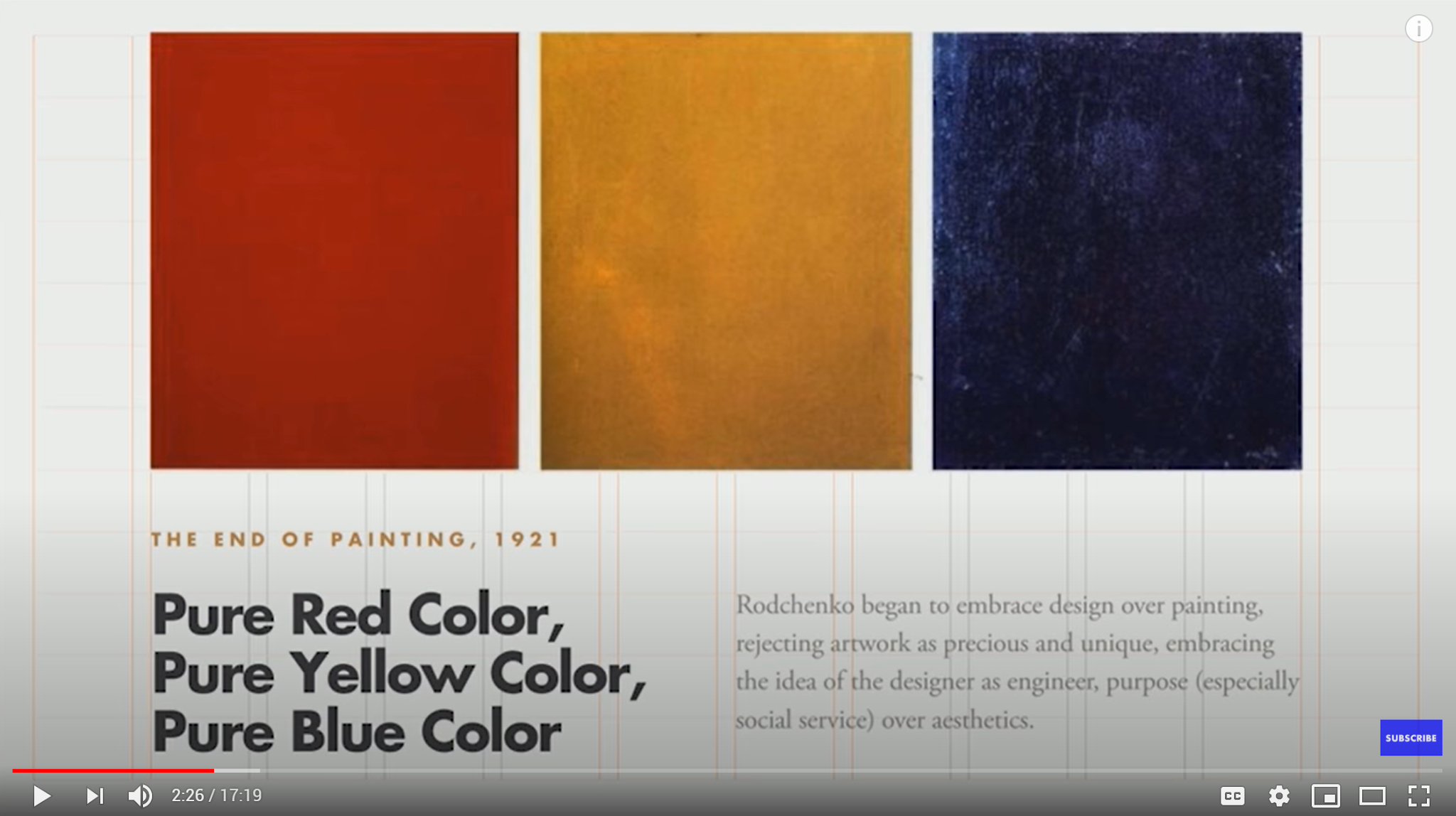
Graphic Design Pioneer - Alexander Rodchenko Russian Constructivist (https://youtu.be/-MMwGkUioFQ)
 |
| Fig. 4.2: Graphic Design Pioneer - Alexander Rodchenko Russian Constructivist |
This video speaks of Russian artist-turned-designer Alexander Rodchenko who is considered one of the fathers of the Russian Constructivism movement, his role in said movement and how his work has influenced contemporary art and design.
Week 8 (14/10/20)
Bad typography has ruined more than just the Oscars (https://youtu.be/eZSe4xVXHhI)
 |
| Fig. 4.3: Bad typography has ruined more than just the Oscars |
While preparing for my final project, I was looking through articles and videos on bad typography usage and watched this video on how it has caused a number of incidents that could have been alleviated with better design.


