Typography - Project 2: Font Design
 |
9/10/19 - 23/10/19 (Week 7 - Week 9)
Ahmed Yaman Ibrahim (0341119)
Typography
Project 2
LECTURE NOTES
Lecture 7: Describing letterforms & Project 2 Briefing
09/10/19 (Week 7)
I was absent this week, but I went through the presentation for the lecture, which explained the basics of type anatomy.

Fig. 1.1: Glossary of terms for type anatomy
Baseline: The imaginary at line the visual base of the letterforms.
Median: The imaginary line defining the x-height of letterforms.
X-height: The height in any typeface of the lowercase ‘x’.
Stroke: Any line that defines the basic letterform.
Apex / Vertex: The point created by joining two diagonal stems (apex above and vertex below).
Arm: Short strokes off the stem of the letterform, either horizontal (E, F, L) or inclined upward (K, Y).
Ascender: The portion of the stem of a lowercase letterform that projects above the median.
Barb: The half-serif finish on some curved strokes.
Beak: The half-serif finish on some horizontal arms.
Bowl: The rounded form that describes a counter. The bowl may be either open or closed.
Bracket: The transition between the serif and the stem.
Cross Bar: The horizontal stroke in a letterform that joins two stems together.
Cross Stroke: The horizontal stroke that intersects the stem of a lowercase T or F.
Crotch: The interior space where two strokes meet.
Descender: The portion of the stem of a lowercase letterform that projects below the baseline.
Ear: The stroke extending out from the main stem or body of the letterform.
Em/en: Originally referring to the width of an uppercase M, an em is now the distance equal to the size of the typeface (an em in 48 points, for example). An en is half the size of an em. Most often used to describe em/en spaces and em/en dashes.
Finial: The rounded non-serif terminal to a stroke.
Leg: Short stroke off the stem of the letterform, either at the bottom of the stroke (L) or inclined downward (K, R).
Ligature: The character formed by the combination of two or more letterforms.
Link: The stroke that connects the bowl and the loop of a lowercase G.
Loop: In some typefaces, the bowl created in the descender of the lowercase G.
Serif: The right-angled or oblique foot at the end of the stroke.
Shoulder: The curved stroke that is not part of a bowl.
Spine: The curved stem of the S.
Spur: The extension the articulates the junction of the curved and rectilinear stroke.
Stem: The significant vertical or oblique stroke.
Stress: The orientation of the letterform, indicated by the thin stroke in round forms.
Swash: The flourish that extends the stroke of the letterform.
Tail: The curved diagonal stroke at the finish of certain letterforms.
Terminal: The self-contained finish of a stroke without a serif. This is something of a catch-all term. Terminals may be flat (‘T’ above), flared, acute, (‘t’ above), grave, concave, convex, or rounded as a ball or a teardrop (see finial). This was followed by an explanation of what else is included in a typeface beyond the 26 letters of the alphabet—numerals, punctuation marks and so on.
Uppercase: Capital letters, including certain accented vowels, the c cedilla and n tilde, and the a/e and o/e ligatures.
Lowercase: Lowercase letters include the same characters as uppercase.
Small Capitals: Uppercase letterforms drawn to the x-height of the typeface. Small Caps are primarily found in serif fonts as part of what is often called expert set. Most type software includes a style command that generates a small cap based on uppercase forms.

Fig. 1.2: Uppercase and lowercase numerals
Uppercase Numerals: Also called lining figures, these numerals are the same height as uppercase letters and are all set to the same kerning width. They are most successfully used with tabular material or in any situation that calls for uppercase letters.
Lowercase Numerals: Also known as old style figures or text figures, these numerals are set to x-height with ascenders and descenders. They are best used when ever you would use upper and lowercase letterforms. Lowercase numerals are far less common in sans serif type-faces than in serif.

Fig. 1.3: Punctuation and special characters
Punctuation and miscellaneous characters: Although all fonts contain standard punctuation marks, miscellaneous characters can change from typeface to typeface. It is important to be acquainted with all the characters available in a typeface before you choose the appropriate type for a particular job.
The presentation went on to explain the different styles found in a type family, such as Italic, Boldface and Condense.

Fig. 1.4: Styles found in a type family
I was absent this week, but I went through the presentation for the lecture, which explained the basics of type anatomy.
 |
| Fig. 1.1: Glossary of terms for type anatomy |
Median: The imaginary line defining the x-height of letterforms.
X-height: The height in any typeface of the lowercase ‘x’.
Stroke: Any line that defines the basic letterform.
Apex / Vertex: The point created by joining two diagonal stems (apex above and vertex below).
Arm: Short strokes off the stem of the letterform, either horizontal (E, F, L) or inclined upward (K, Y).
Ascender: The portion of the stem of a lowercase letterform that projects above the median.
Barb: The half-serif finish on some curved strokes.
Beak: The half-serif finish on some horizontal arms.
Bowl: The rounded form that describes a counter. The bowl may be either open or closed.
Bracket: The transition between the serif and the stem.
Cross Bar: The horizontal stroke in a letterform that joins two stems together.
Cross Stroke: The horizontal stroke that intersects the stem of a lowercase T or F.
Crotch: The interior space where two strokes meet.
Descender: The portion of the stem of a lowercase letterform that projects below the baseline.
Ear: The stroke extending out from the main stem or body of the letterform.
Em/en: Originally referring to the width of an uppercase M, an em is now the distance equal to the size of the typeface (an em in 48 points, for example). An en is half the size of an em. Most often used to describe em/en spaces and em/en dashes.
Finial: The rounded non-serif terminal to a stroke.
Leg: Short stroke off the stem of the letterform, either at the bottom of the stroke (L) or inclined downward (K, R).
Ligature: The character formed by the combination of two or more letterforms.
Link: The stroke that connects the bowl and the loop of a lowercase G.
Loop: In some typefaces, the bowl created in the descender of the lowercase G.
Serif: The right-angled or oblique foot at the end of the stroke.
Shoulder: The curved stroke that is not part of a bowl.
Spine: The curved stem of the S.
Spur: The extension the articulates the junction of the curved and rectilinear stroke.
Stem: The significant vertical or oblique stroke.
Stress: The orientation of the letterform, indicated by the thin stroke in round forms.
Swash: The flourish that extends the stroke of the letterform.
Tail: The curved diagonal stroke at the finish of certain letterforms.
Terminal: The self-contained finish of a stroke without a serif. This is something of a catch-all term. Terminals may be flat (‘T’ above), flared, acute, (‘t’ above), grave, concave, convex, or rounded as a ball or a teardrop (see finial). This was followed by an explanation of what else is included in a typeface beyond the 26 letters of the alphabet—numerals, punctuation marks and so on.
Uppercase: Capital letters, including certain accented vowels, the c cedilla and n tilde, and the a/e and o/e ligatures.
Lowercase: Lowercase letters include the same characters as uppercase.
Small Capitals: Uppercase letterforms drawn to the x-height of the typeface. Small Caps are primarily found in serif fonts as part of what is often called expert set. Most type software includes a style command that generates a small cap based on uppercase forms.
 |
| Fig. 1.2: Uppercase and lowercase numerals |
Uppercase Numerals: Also called lining figures, these numerals are the same height as uppercase letters and are all set to the same kerning width. They are most successfully used with tabular material or in any situation that calls for uppercase letters.
Lowercase Numerals: Also known as old style figures or text figures, these numerals are set to x-height with ascenders and descenders. They are best used when ever you would use upper and lowercase letterforms. Lowercase numerals are far less common in sans serif type-faces than in serif.
 |
| Fig. 1.3: Punctuation and special characters |
Punctuation and miscellaneous characters: Although all fonts contain standard punctuation marks, miscellaneous characters can change from typeface to typeface. It is important to be acquainted with all the characters available in a typeface before you choose the appropriate type for a particular job.
The presentation went on to explain the different styles found in a type family, such as Italic, Boldface and Condense.
 |
| Fig. 1.4: Styles found in a type family |
Lecture 8: Understanding letterforms
16/10/19 (Week 8)
In this lecture, we looked into the nuances that go into making each typeface unique, such as using different stroke weights in one letterform while maintaining visual symmetry.
It is also important to note that although the x-height generally dictates the size of lowercase letters on a typeface, curved strokes such as in ‘s’, must rise above the median (or sink below the baseline) in order to appear to be the same size as the vertical and horizontal strokes they adjoin.
Just as important as recognizing specific letterforms is developing a sensitivity to the counterform (or counter)—the space described, and often contained, by the strokes of the form. When letters are joined to form words, the counterform includes the spaces between them. The latter is particularly an important concept when working with letterforms like lowercase ‘r’ that have no counters per se.
Lecture 9: Project 2 final week
 |
| Fig. 1.5: Different stroke weights used in one letterform; each bracket also has a unique arc |
It is also important to note that although the x-height generally dictates the size of lowercase letters on a typeface, curved strokes such as in ‘s’, must rise above the median (or sink below the baseline) in order to appear to be the same size as the vertical and horizontal strokes they adjoin.
Just as important as recognizing specific letterforms is developing a sensitivity to the counterform (or counter)—the space described, and often contained, by the strokes of the form. When letters are joined to form words, the counterform includes the spaces between them. The latter is particularly an important concept when working with letterforms like lowercase ‘r’ that have no counters per se.
 |
| Fig. 1.6: Counterforms between letters |
Lecture 9: Project 2 final week
23/10/19 (Week 9)
No lecture today as Mr Vinod and Mr Shamsul provided their feedback as we finalized our work for Project 2.
INSTRUCTIONS
PROJECT 2: Font Design
For this project, we were to draw inspiration from one of the 9 type families given to us, and come up with a font design of our own for the given set of letters and punctuation marks ( d g i s n o e h t k r ! . , ). Before commencing our work for Project 2, we were to study and analyze 4 letters of our chosen typeface by dissecting and deconstructing it on Illustrator.
I decided to go with Gill Sans as my chosen typeface and proceeded to dissect 4 of the given letters on Illustrator:
Afterwards, I sketched out my designs for how I wanted my font to look like.
I decided to go with Gill Sans as my chosen typeface and proceeded to dissect 4 of the given letters on Illustrator:
 |
Fig. 2.1: Project 2 - Font dissection "n" |
 |
Fig. 2.2: Project 2 - Font dissection "e" |
 |
Fig. 2.3: Project 2 - Font dissection "h" |
 |
Fig. 2.4: Project 2 - Font dissection "k" |
Afterwards, I sketched out my designs for how I wanted my font to look like.
 |
| Fig. 2.5: Project 2 - Sketches |
The first sketch is my attempt at recreating Gill Sans just to get a feel of how it looks when I draw it manually. The second sketch is my first option based off of Gill Sans, with a different stroke width and sharp edges, as well as a different design for the letter 'g'. The third sketch is similar to the previous one, but with edges that are less sharp, by curving them towards a point. This is the option that Mr Vinod and Mr Shamsul suggested that I go with, and so I began digitizing on Illustrator.
 |
| Fig. 2.6: Project 2 - Digitizing on Illustrator, trial 1 (process) |
 |
| Fig. 2.7: Project 2 - Digitizing on Illustrator, trial 1 (wireframe) |
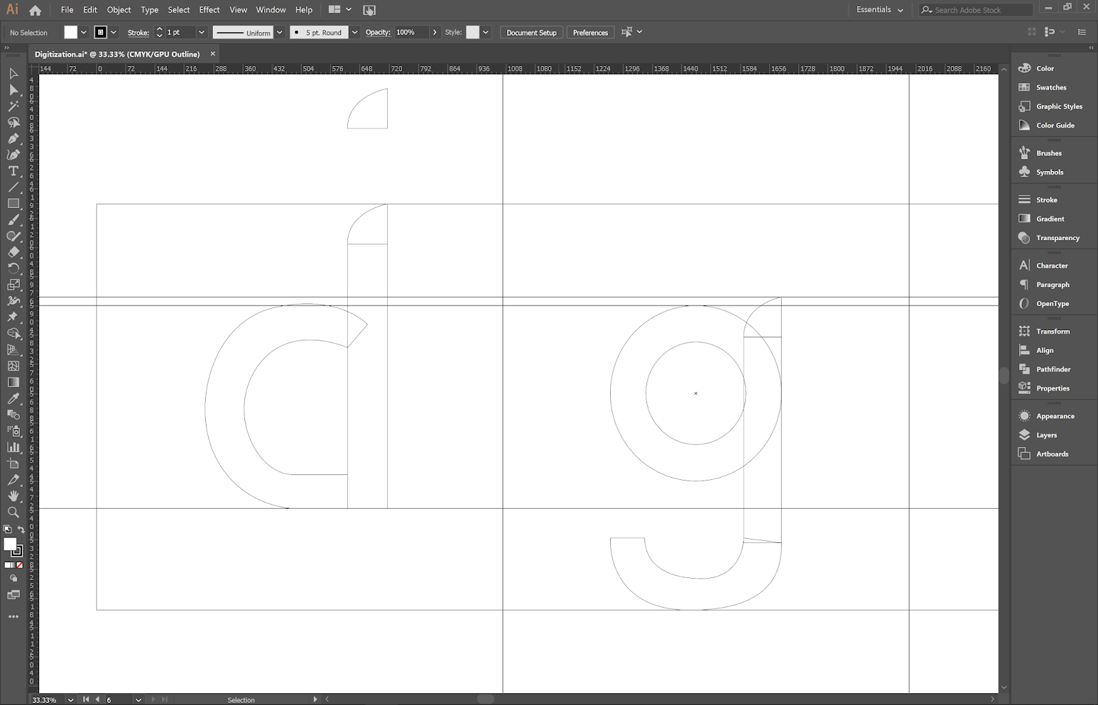
I constructed basic shapes using the pen and shape tools and laid them together based on my sketches and the typeface I used for inspiration (Gill Sans). I followed the guidelines given to us by Mr Vinod and laid out all the letters on a single artboard, separated by guides.
 |
| Fig. 2.8: Project 2 - Digitizing on Illustrator, trial 1 (final) |
Upon consulting with Mr Vinod and Mr Shamsul, they said that the design looked too similar to Gill Sans and that I should make a few more adjustments. Onto trial 2:
 |
| Fig. 2.9: Project 2 - Digitizing on Illustrator, trial 2 (process) |
 |
| Fig. 2.10: Project 2 - Digitizing on Illustrator, trial 2 (final) |
Here, I tried to deviate further from Gill Sans by redoing the edges of each letter into the style from my sketch. Mr Vinod helped me adjust this option further by going through each letter and giving me tips on how to make them consistent with each other while maintaining their own individuality. With his advice, I made a few more adjustments:
 |
| Fig. 2.11: Project 2 - Digitizing on Illustrator, trial 3 (process) |
 |
| Fig. 2.12: Project 2 - Digitizing on Illustrator, trial 3 (final) |
Mr Vinod and Mr Shamsul approved this design and told me to proceed with creating the letters on FontLab.
 |
| Fig. 2.13: Project 2 - FontLab (Importing from Illustrator) |
 |
| Fig. 2.14: Project 2 - FontLab (All characters imported) |
 |
| Fig. 2.15: Project 2 - FontLab (Laying out all the characters in a new Metrics Window and adjusting the kerning) |
 |
| Fig. 2.16: Project 2 - FontLab (Trying out different combinations of letters to further adjust kerning) |
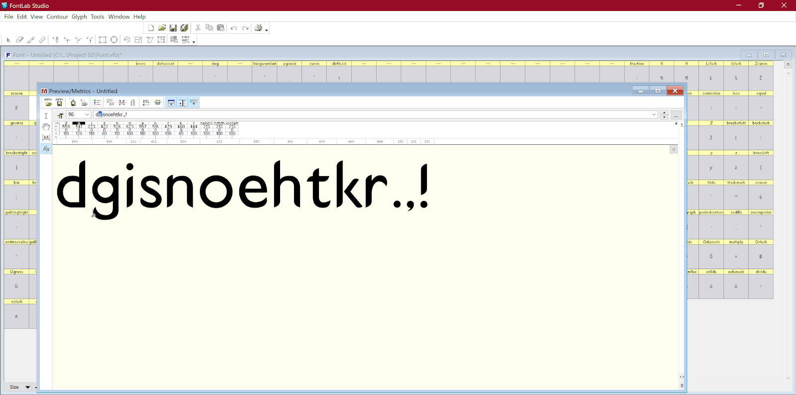
 |
| Fig. 2.17: Project 2 - FontLab (Typing out a phrase with spacing) |
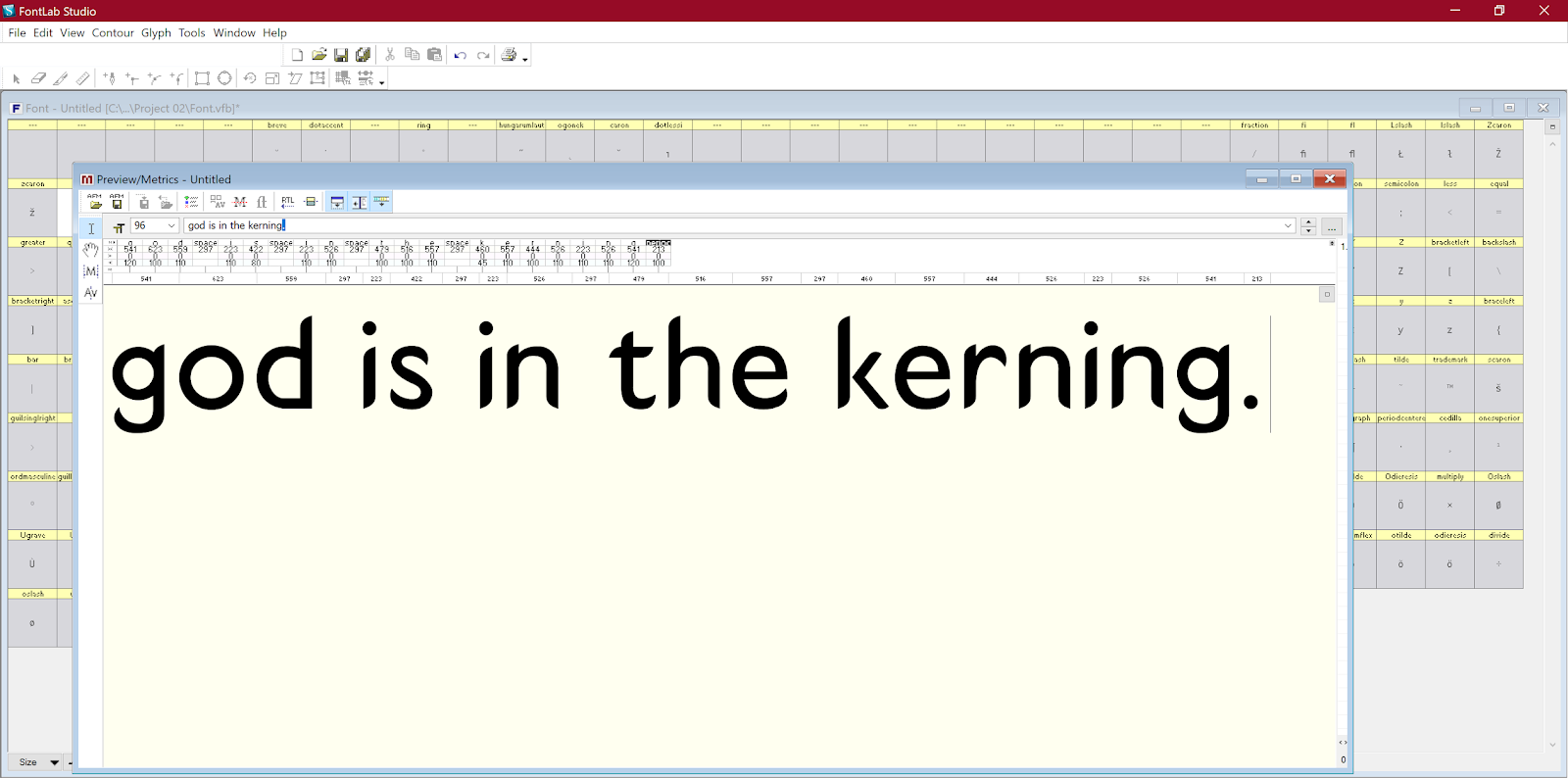
After creating our font on FontLab, we generated the font for use on the computer and installed it as instructed by Mr Vinod. We then created a composition with the given phrase ("god is in the kerning") on an A4 sheet, on Illustrator.
 |
| Fig. 2.18: Project 2 - Font design "d" |
 |
| Fig. 2.19: Project 2 - Font design "g" |
 |
| Fig. 2.20: Project 2 - Font design "i" |
 |
| Fig. 2.21: Project 2 - Font design "s" |
 |
| Fig. 2.22: Project 2 - Font design "n" |
 |
| Fig. 2.23: Project 2 - Font design "o" |
 |
| Fig. 2.24: Project 2 - Font design "e" |
 |
| Fig. 2.25: Project 2 - Font design "h" |
 |
| Fig. 2.26: Project 2 - Font design "t" |
 |
| Fig. 2.27: Project 2 - Font design "k" |
 |
| Fig. 2.28: Project 2 - Font design "r" |
 |
| Fig. 2.29: Project 2 - Font design (punctuation) |
 |
| Fig. 2.30: Project 2 - Font design (characters laid out on the same baseline) |
 |
| Fig. 2.31: Project 2 - Composition |
Fig. 2.32: Project 2 - Composition (FINAL)
I decided to name my font design "Butterknife Sans" as the edges of the letters reminded me of the blade of a butter knife.
FEEDBACK
Week 7
I did not receive any feedback this week as I was absent due to illness.
Week 8
After showing my sketches to Mr Vinod and Mr Shamsul, they approved the third option for me to digitize. After digitization, they suggested that I make a few more adjustments to my font as it seemed a bit too similar to the typeface I used for inspiration (Gill Sans). We were also instructed to update our blogs regularly without leaving it for later.
Week 9
After consulting Mr Vinod for feedback prior to the class, he instructed that I make a few more changes to refine the font. Later in class, he approved the font for me to generate, after the changes were made. The A4-size composition was approved as well, after making some minor changes. As for general class feedback, we were told that when generating the font, we should make sure that the format is TrueType/OpenType. We should also remember to upload each letter of the font as a JPEG on the blog post, as well as to keep all the letters on the same baseline rather than in a grid, when showing all the letters together.
Final feedback on week 11
Mr Vinod said I did a good job on my font for Project 2 and that the design was relatively consistent across the letters aside from some minor smoothness issues in some of them.
REFLECTIONS
Experience:
I had bit of trouble catching up in week 7 as I missed two of my classes due to illness, so I had quite a lot of work piled up that I needed to finish. In week 8, I spent a lot of time digitizing the fonts on Illustrator as I kept noticing more and more adjustments I could make, the more time I spent working on it. In week 9, I was a bit confused by FontLab's controls but I managed to get a hang of it for the sake of this project, at the very least.
Observation:
During the three weeks of the project, I noticed that despite a lot of students choosing the same typeface for their inspiration, their execution of their on fonts were vastly different from each other. It was quite interesting to go through their work with them, and we helped each other out quite a bit.
Findings:
My biggest takeaway from the time I spent designing a font on this project is that details are everything; there is no end to the adjustments you can make to refine your designs. The end result of the work spent on creating something for yourself is quite worthwhile.
FURTHER READING
The Typography Idea Book - Steven Heller & Gail Anderson
Week 7 - 8
 |
| Fig. 3.1: The Typography Idea Book by Steven Heller and Gail Anderson |
This book was incredibly insightful; it consists of work ranging from 50 master designers, from Eric Gill to Saul Bass, and sections of the book are divided by how the designers applied typography in various approaches to suit the situation, with explanations of how they were used. Studying their work proved to be quite helpful and I was able to better understand how typography can be used in different circumstances.
Design Elements: A Graphic Style Manual - Timothy Samara
Design Elements: A Graphic Style Manual - Timothy Samara
Week 8 - 9
 |
| Design Elements: A Graphic Style Manual by Timothy Samara |
Although this book isn't specifically about typography, the section it contains on the subject was incredibly useful to me. The section on typography details the specifics of letterforms and counterforms, as well as understanding how to space blocks of text based on style and visual weight. There is also a section on how the use of color affects typography, which I feel will be quite useful for me in future projects.


