Typography - Project 1: Text Formatting & Expression

25/09/19 - 09/10/19 (Week 5 - Week 7)
Ahmed Yaman Ibrahim (0341119)
Typography
Project 1
LECTURE NOTES
Lecture 4: Project 1 Briefing (cont. from Typography - Exercises post)
18/09/19 (Week 4)
Our task is to typographically express text given to us in a two-page editorial spread, without the use of images and only minor graphical elements. The page size given to us was 200x200mm.
Lecture 5: Project 1 cont.
25/09/19 (Week 5)
No lecture this week as most of the class time went into the feedback session for Project 1. Mr Vinod and Mr Shamsul had a look at our progress and instructed us on how we can improve our work over the week.
Lecture 6: Project 1 final week
Lecture 6: Project 1 final week
02/10/19 (Week 6)
As with the previous week, there was no lecture as Mr Vinod and Mr Shamsul provided their feedback as we finalized our work for Project 1. We were given a break over the week and we were to commence our work for Project 2 from next class onwards.
INSTRUCTIONS
PROJECT 1: Text Formatting & Expression
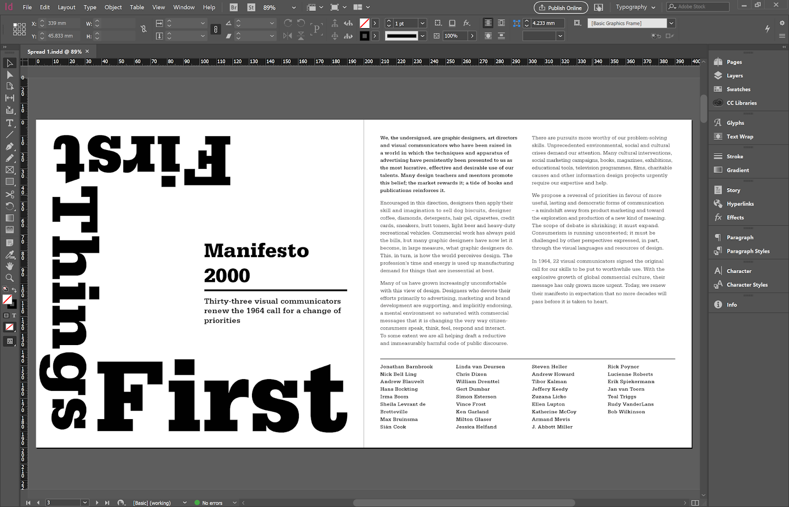
From the content given to us, I decided to go with the First Things First Manifesto 2000. I read through it and understood it as a serious and no-nonsense text that needed to be very much in the reader's face, while also having all the information laid out in a way that's clear and readable. Based on this, I came up with an initial design:
Fig. 2.1: Project 1 - Option 1, version 1
For this design, I used Serifa. Personally, I was a bit skeptical about the headline text design as I felt I could do more with it, but Mr Vinod said that it was alright, so I decided to keep it as one option and work on some more. While doing the tracking for the paragraph text on this design, I noticed there were a lot of double spaces between words when I pasted them onto the software from the source.
 |
| Fig. 2.2: Project 1 - Fixing double spaces between words |
I also had to add some forced line breaks as tracking by itself didn't align the paragraph the way I wanted it to.
 |
| Fig. 2.3: Project 1 - Adding forced line breaks during tracking to align the paragraph properly |
I went on to make a couple more options. I made several copies of each option in order to make minor changes without deleting each version; this proved to be helpful as I backtracked with a lot of my designs when I figured out how to make better changes—my final version turned out to be a variation of the first option I came up with, albeit being quite different.
 |
| Fig. 2.4: Project 1 - Option 1, version 2 |
 |
| Fig. 2.5: Project 1 - Option 1, version 3 |
 |
| Fig. 2.6: Project 1 - Option 2, version 1 |
For my second option, I used Gill Sans as my typeface. I decided to go for a more minimalist design for the headline text, but I also added a subtle drop shadow behind the title to give a bit more visual weight. I went on to make another version of this design:
 |
| Fig. 2.7: Project 1 - Option 2, version 2 |
Here, I aligned the headline text to the center and readjusted lengths of the paragraph boxes. Mr Shamsul approved of this design, but I personally felt that it felt a bit too simple to properly convey the mood behind the text; the space between the last paragraph and the list of names felt a bit awkward as well.
Fig. 2.8: Project 1 - Option 2, final version
I continued to experiment with the headline text, while making adjustments to the body text as I saw fit.
 |
| Fig. 2.9: Project 1 - Option 3, version 1 |
 |
| Fig. 2.10: Project 1 - Option 3, version 2 |
 |
| Fig. 2.11: Project 1 - Option 3, version 3 |
I stuck with Gill Sans for this option as well; I wanted the headline to be in the reader's face and catch their attention.
Fig. 2.12: Project 1 - Option 3, final version
For the next option, I tried the same concept as the previous option with a large headline text, but with Univers as my typeface. I made subtle changes to the paragraph formatting as I went along.
 |
| Fig. 2.13: Project 1 - Option 4, version 1 |
 |
| Fig. 2.14: Project 1 - Option 4, version 2 |
 |
| Fig. 2.15: Project 1 - Option 4, version 3 |
This last version was just an experiment to see how the spread would look like in another orientation.
Fig. 2.16: Project 1 - Option 4, final version
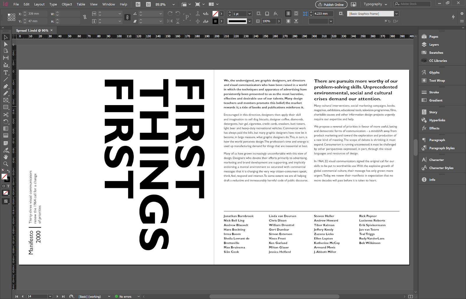
Eventually, after a bit of discussion with Mr Vinod and Mr Shamsul, I decided to go back to my original design and make a few alterations.
This time, I decided to use Serifa for the headline text and Univers for the paragraph body; I was unsure if this would work out well but Mr Vinod said that it did, so I decided to move forward with it.
 |
| Fig. 2.17: Project 1 - Option 5, version 1 |
 |
| Fig. 2.18: Project 1 - Option 5, version 2 |
This last version ended up being my final after approval from Mr Vinod and Mr Shamsul.
Fig. 2.19: Project 1 - Option 5, final version (FINAL)
FEEDBACK
Week 5
Mr Vinod says the initial design looks good despite my doubtfulness with the headline text design, and he said that I should come up with a few more options. He also gave a lot of general feedback for the class; we are to maintain 55-65 character line length for large amounts of text, and 35-55 if necessary for smaller amounts of text. Also, for Project 1, the bodies of text on must be connected via text boxes to avoid accidentally deleting a sentence. We must also be careful of rivers when using justified text, and left aligned text should not include both indentation and paragraph spacing; indentation is only acceptable in justified text with no paragraph spacing, as indentations are already used to indicate a paragraph space.
Week 6
After going through the options I made for Project 1, Mr Vinod and Mr Shamsul had different opinons on which one I should go with but eventually settled for the initial design I made, which I had later refined. They then advised that I make a few adjustments to the layout to better balance it out. We were also advised to use a mouse when doing our work as opposed to using the touchpad. Additionally, Mr Vinod reiterated that the paragraph text boxes in our spreads should stay linked.
REFLECTIONS
Experience:
In week 5, I still had some trouble figuring out additional designs for the headline text, as I feel it is not expressive enough of the personality the written content is giving off. In week 6, I spent a lot of time coming up with variations of the headline text, while experimenting with different typefaces for the body text.
Observation:
I noticed during the two weeks of the project that patience is key when formatting paragraphs as individual tracking of each line can go either way.
Findings:
In week 5, I learned that sketching out how to design the headline text helped me visualize my ideas better. In week 6, as I spent a lot of time designing the headline text, I began to notice how different ways of displaying the headline text conveyed different feelings, if that makes sense.
FURTHER READING
Stop Stealing Sheep and find out how type works - Erik Spiekermann
Week 5 - 6
 |
| Fig. 3.1: Stop Stealing Sheep and find out how type works by Erik Spiekermann |
This book was a fun read; it had a lot of illustrations and its general layout gave it quite a bit of personality. That being said, I learned a lot as well. The book gives the reader a general breakdown of what type is, how it works in the different contexts of design and how the way it is used or applied can affect factors such as readability and aesthetic appearance.


