30/08/19 - 01/11/19 (Week 1 - Week 10)
Ahmed Yaman Ibrahim (0341119)
Digital Photography & Imaging
Project 1: Exercises
LECTURE NOTES
Lecture 1: Introduction & basics of Photoshop
30/08/19 (Week 1)
Our first class began with an introduction by our lecturers, Mr. Chong and Mr. Jeffrey, of the general module and lesson breakdown. We then got to know our classmates by doing our own introductions.
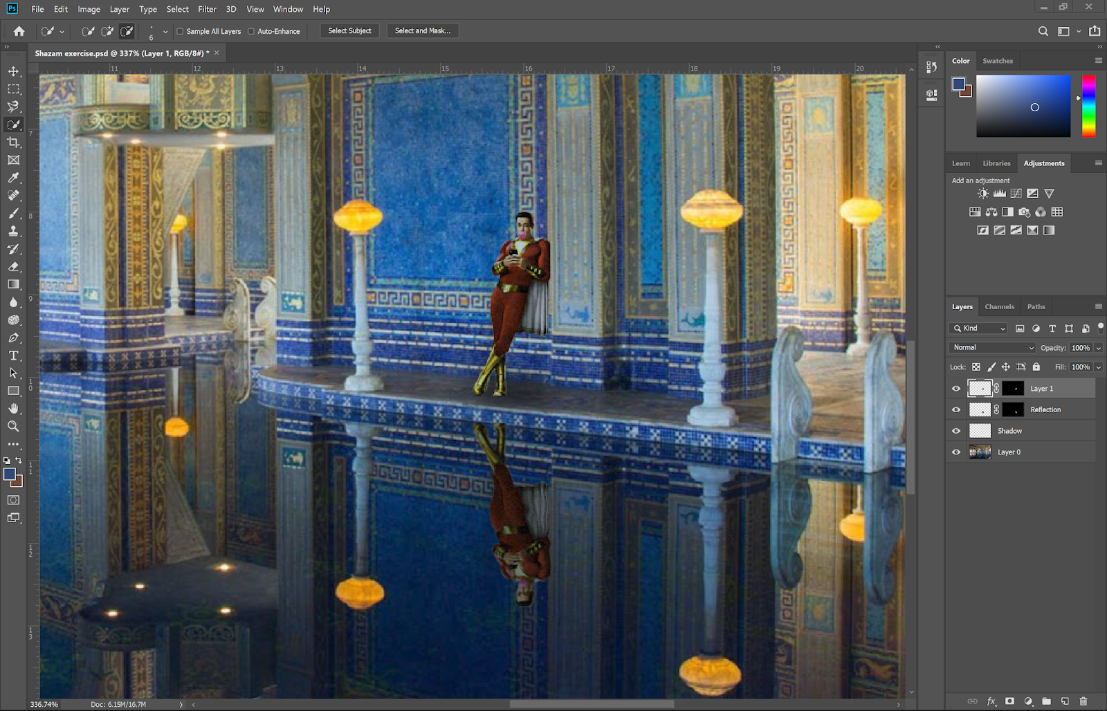
Afterwards, we began a lesson on the basics of Photoshop, starting with how to place an object on a background and editing it so it blends in properly. For this lesson, we were given a background and a character to Photoshop onto it:
 |
| Fig. 1.1: Background - Hearst Mansion |
 |
| Fig. 1.2: Figure to Photoshop - Shazam |
We learned how to use selection tools pick out Shazam from the rest of the poster and then isolate him using a layer mask.
 |
| Fig. 1.3: Layer mask around Shazam |
We then learned to import him into the background image, place him and then edit the image so that he blends in properly, by matching him to the background colors. We then added a shadow behind him, along with some noise so he doesn't stick out too much from the rest of the image. We then added his reflection in the water beneath him as well as a subtle ripple effect.
 |
| Fig. 1.4: Shazam added into background with matched color, shadow and reflection |
 |
| Fig. 1.5: Hearst mansion exercise - final result |
Lecture 2: Ghost house
06/09/19 (Week 2)
In this lesson, we learned how to used advanced selection tools to isolate objects in complex images. We were given a set of images (a sky background, a house and a ghost figure) to use to create one composition.
 |
| Fig. 1.6: House |
 |
| Fig. 1.7: Ghost figure |
 |
| Fig. 1.8: Sky background |
We used what we learned with advanced selection tools to isolate the house from the image and add it to the sky background. We then resized it and edited it using what we learned from the previous lesson so it blended in well to the background.
 |
| Fig. 1.9: House added to background and edited to blend in |
We then added in the ghost figure and fiddled with blending modes to make sure she blended in well, and added a subtle glow around her to add an eerie effect to the image.
 |
| Fig. 1.10: Ghost added into image with screen blending mode and a glow effect around her |
 |
| Fig. 1.11: Ghost house - final result |
Lecture 3: Recoloring
13/09/19 (Week 3)
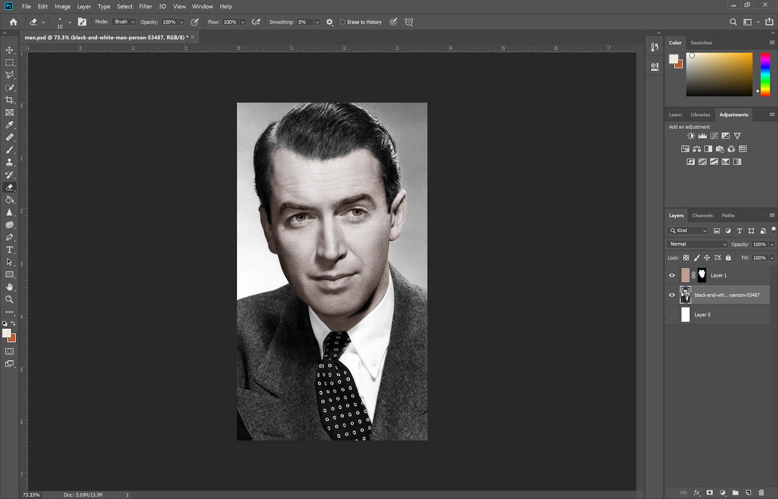
Today's lesson was about learning how to recolor black and white images. We were given a portrait of a man to practice recoloring on.
 |
| Fig. 1.12: Portrait of a man |
We learned a few methods to recolor the image; the first method was to select the skin portion of the face and applying a flat color to it, and then using a blending mode. The second method was to add a solid color layer on top of the image and erasing around the area to be recolored, after using a blending mode. This method can also be applied to add color to the eyes, lips, clothes and background. Using blending modes were essential when attempting to make the recoloring look realistic.
 |
| Fig. 1.13: Recoloring skin |
 |
| Fig. 1.14: Recoloring - final result |
After this lesson, Mr. Jeffrey gave us some advanced tips on how to recolor hair, using the lasso tool to select the area and using the 'refine edge' and 'feather' options, which takes some manual work to adjust the selection depending on how complex the hair on the image is.
Lecture 4: Displacement map (lecture cancelled)
20/09/19 (Week 4)
We did not have a lecture today due to all university classes being cancelled due to the worsening haze conditions; however, we were provided with a video tutorial on how to carry out our next exercise by making use of a displacement map on Photoshop. For the first class exercise, we used a displacement map to add a texture to the Indian flag.
First, I desaturated the image of the silk texture and saved it as the displacement map .psd file.
 |
| Fig. 1.15: Desaturating the silk texture image |
Then, I imported the Indian flag into the original silk texture image. I changed the blending mode to see the texture behind the flag.
 |
| Fig. 1.16: Importing the flag onto the silk texture |
I then applied the displacement filter according to Mr Jeffery's instructions on the video. I also duplicated the flag layer, changed blending mode to Screen and reduced the opacity to bring back some of the original flag color.
 |
| Fig. 1.17: Displacement exercise 1 - final result |
For the second exercise, we were to add a snake skin texture to the face of the man on the portrait from our recoloring exercise.
As the image was already black and white, I saved it as a displacement map and then imported the snake skin texture onto the original, and then applied the displacement effect.
 |
| Fig. 1.18: Displacement exercise 2 - adding snake skin texture to the portrait |
I then erased the areas outside of his skin so the texture would only appear on his skin.
 |
| Fig. 1.19: Displacement exercise 2 - final result |
INSTRUCTIONS
EXERCISE
Hearst mansion exercise (Week 1)
After the first lesson, we applied what we learned to add an image of ourselves to the mansion background instead of Shazam.
 |
| Fig. 2.1: Image of myself |
 |
| Fig. 2.2: Adding myself to the background |
 |
| Fig. 2.3: Adding reflection, noise, shadows and ripple effect |
 |
| Fig. 2.3: Hearst mansion exercise - final result |
Ghost house exercise (Week 2)
For the second exercise, we reapplied what we learned in the lesson to redo the process but with a different house and background. We were urged to try and make the lighting of the house as realistic as possible with the background.
 |
| Fig. 2.4: Chosen background |
 |
| Fig. 2.5: Chosen house |
 |
| Fig. 2.6: Isolating the house from the background using the Polygonal Lasso tool |
During the editing process, I realized that if I was to add the house onto the small island, it would have to be very dark to match the light of the rest of the island. This made the house quite difficult to see in the actual image but nevertheless I felt it was what made the most sense.
 |
| Fig. 2.7: Added the house to the new background, added noise and light shading to the roof of the house and matched the color of the house with the rest of the island. I also added a subtle reflection of the house in the water. |
 |
| Fig. 2.8: Ghost house exercise - final result |
Recoloring exercise (Week 3)
For the third exercise, we were to recolor a portrait of our own. I chose this portrait of a man:
 |
| Fig. 2.9: Portrait of a man |
I then selected his skin areas and created a solid color mask with a subtle skin color.
 |
| Fig. 2.10: Recoloring skin |
I decided to keep his hair color black as I felt it suited his look the best, and then recolored his eyes and lips.
 |
| Fig. 2.11: Recoloring eyes and lips |
I then applied solid color masks to recolor his tie and the background.
 |
| Fig. 2.12: Recoloring exercise - final result |
Changing One's Stripes (Week 4)
For this exercise, we were to interchange the characteristics of two or more animals by swapping their materials and textures, or creating a hybrid animal by applying similar effects. I decided to go with the latter.
I chose this image of a lioness and started off by using the displacement effect to add a giraffe texture to its body. This required some editing to erase the areas outside of the lioness's body.
 |
| Fig. 2.13: Starting image |
 |
| Fig. 2.14: Giraffe texture |
 |
| Fig. 2.15: Lioness with giraffe texture |
I then thought to mix things up further and add a feature from another animal; I chose to go with an elephant's trunk.
 |
| Fig. 2.16: Elephant image |
At this point I realized that it would have made things easier if I edited the elephant trunk onto the lioness first before I applied the displacement effect; so I decided to redo that. I then applied the displacement effect on top of the hybrid lioness-elephant animal.
 |
| Fig. 2.17: Changing One's Stripes - final result |
The Castle of the Pyrenees (Week 5)
For this exercise, we were to use the skills we were taught so far to recreate the Castle of the Pyrenees on Photoshop:
 |
| Fig. 2.18: The Castle of the Pyrenees, René Magritte (1959) |
I began by looking for images I could use as my background; I found two images of the sea and sky and after comparing them I decided to go with the first image as I felt the second image had too much going on in it and could possibly distract from the foreground.
 |
| Fig. 2.19: Background image 1 |
 |
| Fig. 2.20: Background image 2 |
I then looked for images I could use as the rock for the castle to stand on. I searched for images of stones and pebbles that I could enlarge, and found one.
 |
| Fig. 2.21: Rock base for castle |
After attempting to adjust the color of the rock, I realized that it would make more sense if I manually edited the color of both the rock and the background rather than trying to match the color of one to the other, and so I edited them manually.
 |
| Fig. 2.22: Matching the colors of foreground and background |
I then searched for images of castles I can use to place on top of the rock; I combined pictures of two castles to make it more visible on the image, and then adjusted the color to match the rest of the elements as well.
 |
| Fig. 2.23: Castle on top of rock |
 |
| Fig. 2.24: The Castle of the Pyrenees - final result |
FEEDBACK
Week 1
While adding my image to the background of Hearst mansion, Mr Jeffrey suggested that I play around with the reflection of my image in the water to align it properly.
Week 2
During this week's exercise, Mr Jeffrey advised that I should consider how the reflection of the house would appear in the water based on the reflection of the trees on the island, and suggested that I use the Clone Stamp tool to produce the reflection.
Week 3-5
No feedback was given during these weeks.
REFLECTIONS
Experience:
In week 1's exercise, I spent a lot of time trying to figure out how to align the reflection of my image in the water. In week 2's exercise, I struggled a bit with trying to make the house appear realistic on the island while also making it properly visible. Week 3's recoloring exercise was relatively easy for me as I felt it was quite straightforward. In week 4, I had trouble figuring out which animals I could combine for my exercise. Week 5's exercise took longer than I expected as I felt there were always some areas I could improve.
Observation:
In week 1, I noticed that the class more or less consisted of students who were either completely new to design software or had a lot of experience using them. During week 2's exercise, I noticed a lot of classmates including myself spent a bit of time trying to figure out how to be creative with the ghost house composition. In week 3, I saw that a lot of my classmates were very creative with their portrait recoloring. This was also the case in week 4 and 5 with the animal and castle exercises; there were a lot of unique renditions that I probably wouldn't have been able to come up with.
Findings:
When working on the exercises, I understood that the best way to get a hang of using design software is to constantly practice using the tools and shortcuts, and so I spent a lot of time when doing the exercises trying to get used to them.